How do you illustrate a perfect, diverse but fine blend of character?
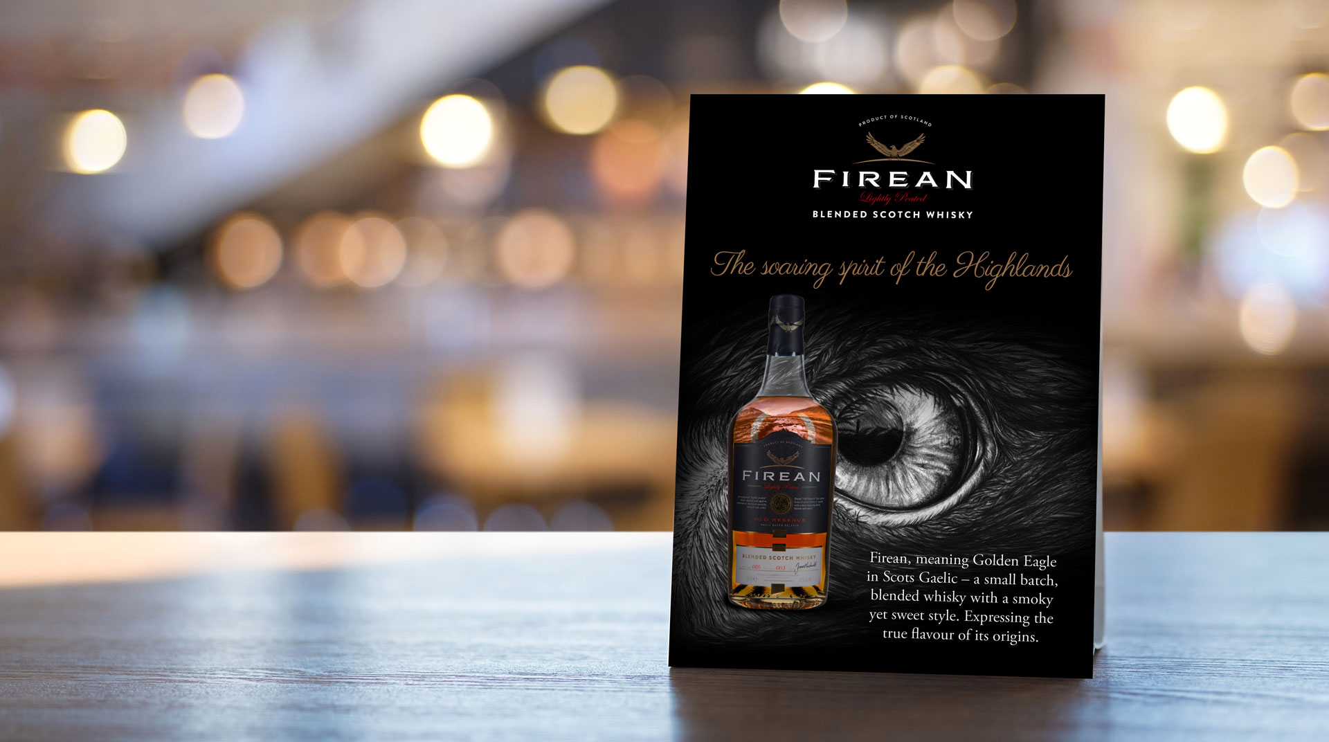
Firean
Blended Scotch Whisky
Opportunity.
Firean, Scots Gaelic for Golden Eagle, is a blended scotch, aged in ex-bourbon barrels. This powerful symbol of a superior whisky needed to be positioned as a premium yet competitively priced alternative to single malt. Perfect, either as a house pour or for neat sipping.
The brand needed a strong presence and personality to present a hand crafted feel, expressing the true flavour of its origins and that it’s more approachable than many a single malt.
Big idea.
Like the soaring eagle this is a whisky with as broad a view of Scotland as you can imagine. A rare bird – a blended whisky with memorable character, to sip, to share, and to savour.
We began by asking, where does Scotch Whisky come from? From Highland water that tumbles over granite, or filters through heather? From Lowland barley? From smoky, peat-fired maltings or charred old oak barrels?
We believe that the whisky and the landscape are inseparable. The broad Scottish views were reflected within the soft smokey tones of the pencil illustration, beautifully depicting the characterful peated blend.
The image continued through the liquid as a convex view, giving the impression of a bird looking down and seeing the diverse landscape below. This added to the inseparable link between the bird and landscape, whilst giving the impression of the two working in harmony.
After the work of Firean whisky, we went on to produce further brands, including Half Crown Gin and Red Griffin Vodka.
“We are extremely pleased with the powerful and thoughtful branding That’s Brave created for the Hayman’s Group. Each brand captures a unique story, evoking ideas of the history and craftsmanship behind our products.”
James Macdonald - Brand Manager
Engagement.
The sales of Firean have showed a strong but steady growth since the development of the new positioning and brand story, particularly throughout the Asian market.