Kapow! With a more authentic and clean Japanese experience.
Yumie
Authentic Japanese sushi
Opportunity.
Ichiban were looking to reposition their Yumie Sushi brand, moving away from a student demographic and gaining a wider audience through larger retailers and food service outlets. There was a concern that the current cartoon look and feel was confusing and didn’t showcase their offer in an appropriate way.
The cartoon style may have appealed to a younger audience but this wasn’t aligned with a typical sushi customer. Yumie needed a more sophisticated, accessible brand which still appealed to a younger audience but encouraged those who are willing to experiment with something new.
Big idea.
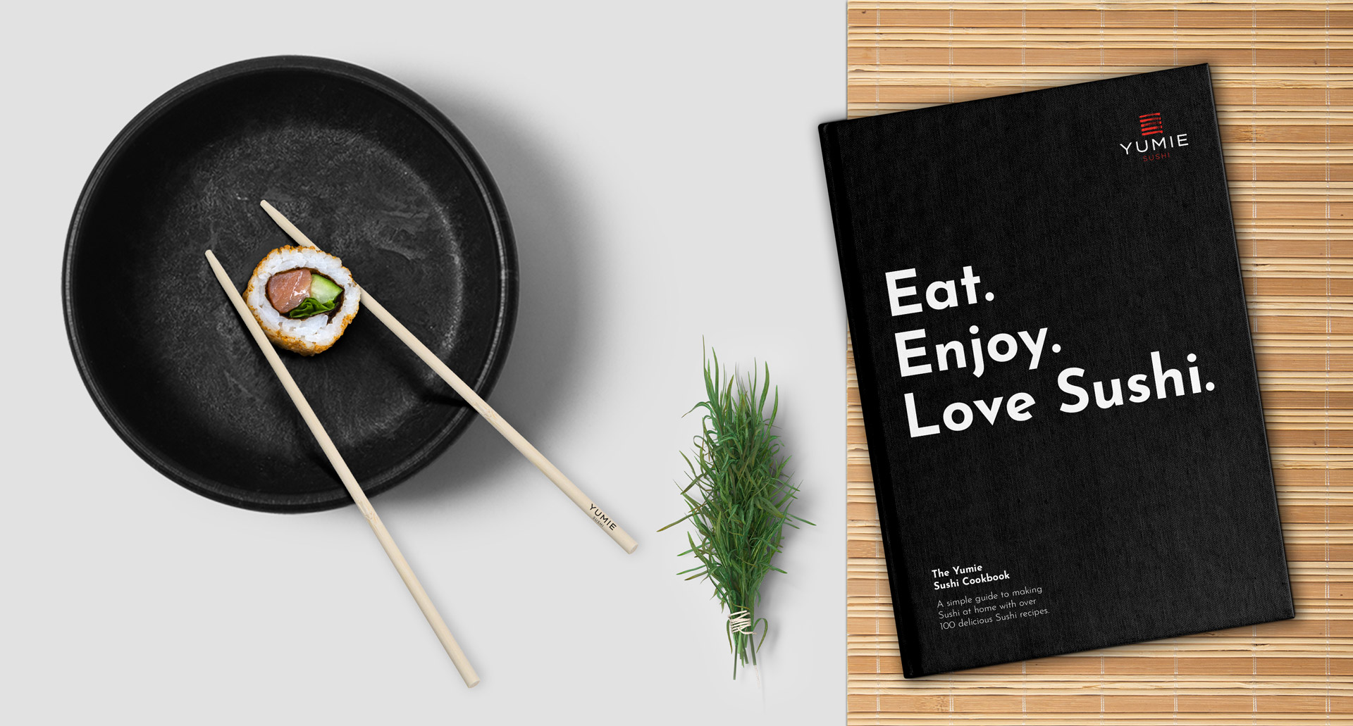
The idea was to position Yumie as the ‘healthy choice’ with a focus on authenticity, accessibility and high quality.
Summarised in a line, ‘Live Simple’ expresses the idea that simple things – in the case of sushi, largely unprocessed things – are somehow more authentic and essentially good.
‘Live Simple’ isn’t pretentious or intimidating, it’s accessible and stylish with a real sense of fun and vibrancy.
Free flowing, hand drawn designs reflect the hand made food inside the pack – implying that this is a produced with the care normally associated with a premium price.
The traditional illustration was used across all products with an additional green to split the vegetarian from the fish and meat sub brands.
The ink illustration not only embedded the authentic feel but also gave a real sense of freshness.