How do you get chocoholics to think like sommeliers?
Tosier
Direct trade bean-to-bar chocolate
Opportunity.
Inspired by Thomas Tosier, personal chocolate maker to King George I, Tosier Chocolatemaker is an award winning bean-to-bar chocolate maker based in Suffolk.
The cocoa beans are sourced directly from the farmers – so there is a full transparency and a positive financial impact on the local community. Created in small batches, the final chocolate has only three ingredients.
The brand needed a craft presence to sit in the bean-to-bar community, but confidently communicate the origin of the beans and their distinctive flavours.
Big idea.
Like a fine red wine, you wouldn’t expect a French appellation to taste the same as an Australian. This is just the same with chocolate and the communication of this was key to enable a greater appreciation of the genetics and terroir of the chocolate.
The beans are sourced in micro-batches which has a distinct impact on the taste, meaning each single origin cacao is unique in flavour. So flavoursome that you would think there were additional inclusions but each bar is made from the same three ingredients – 70% cocoa beans, unrefined organic cane sugar and cocoa butter.
The packaging reflected the premium market placement of a bean-to-bar product, but without an overly crafted look and feel.
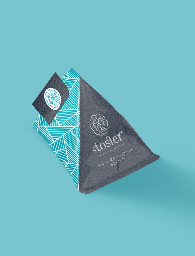
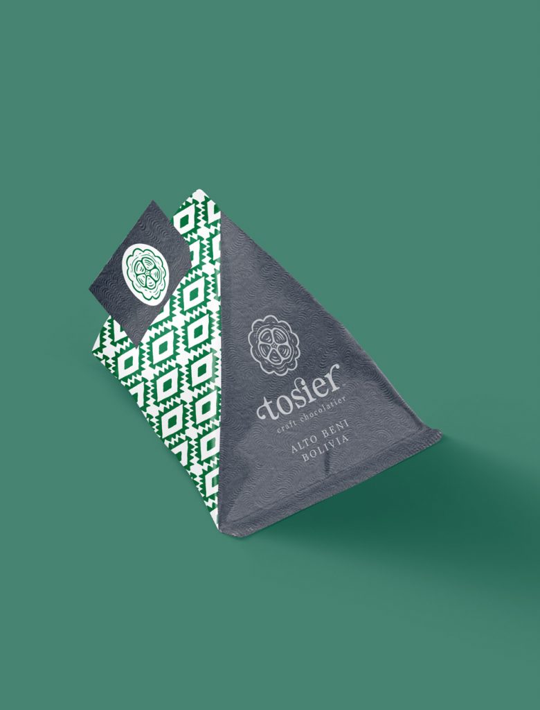
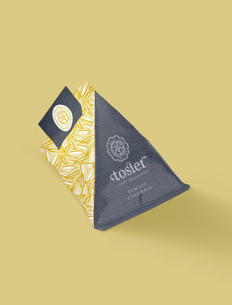
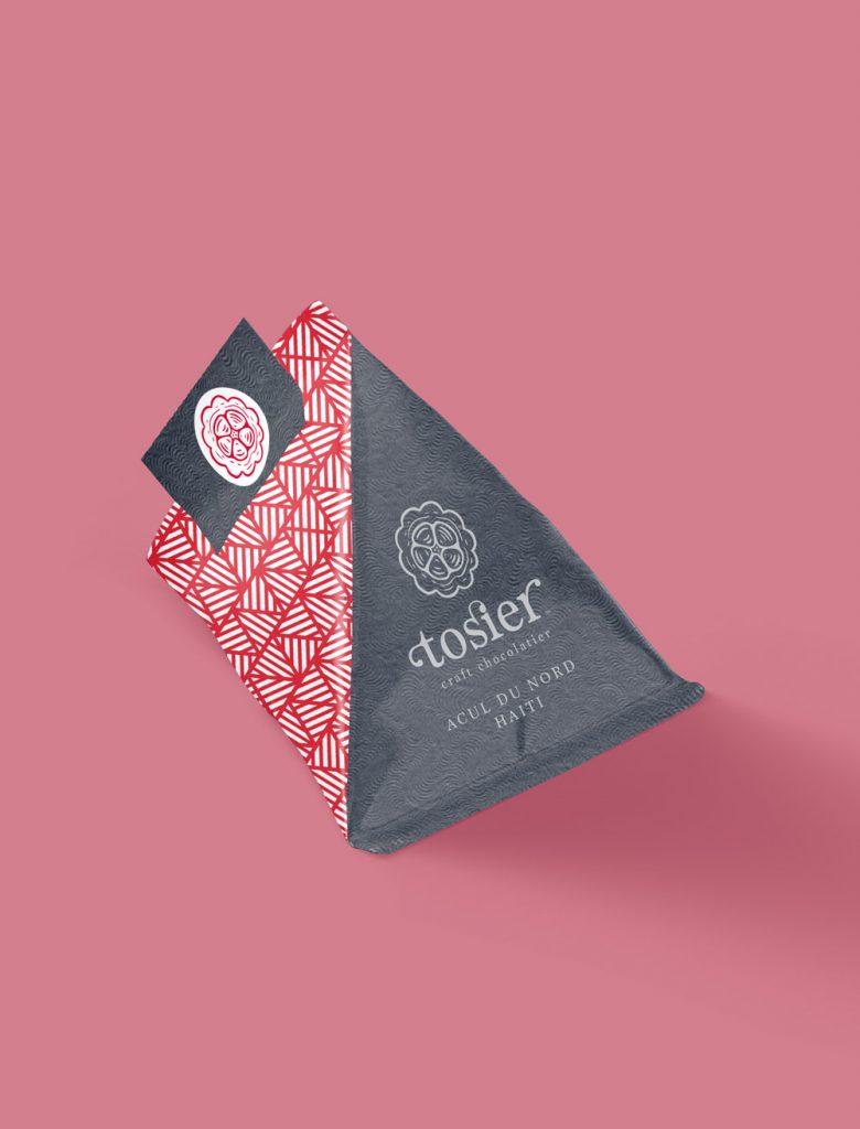
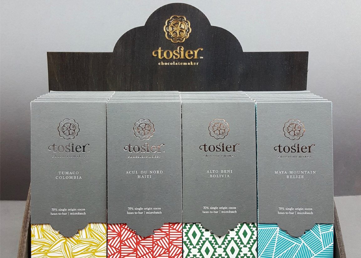
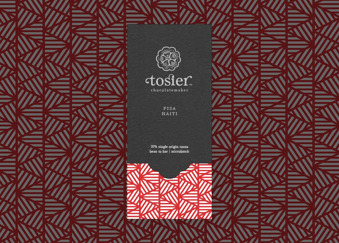
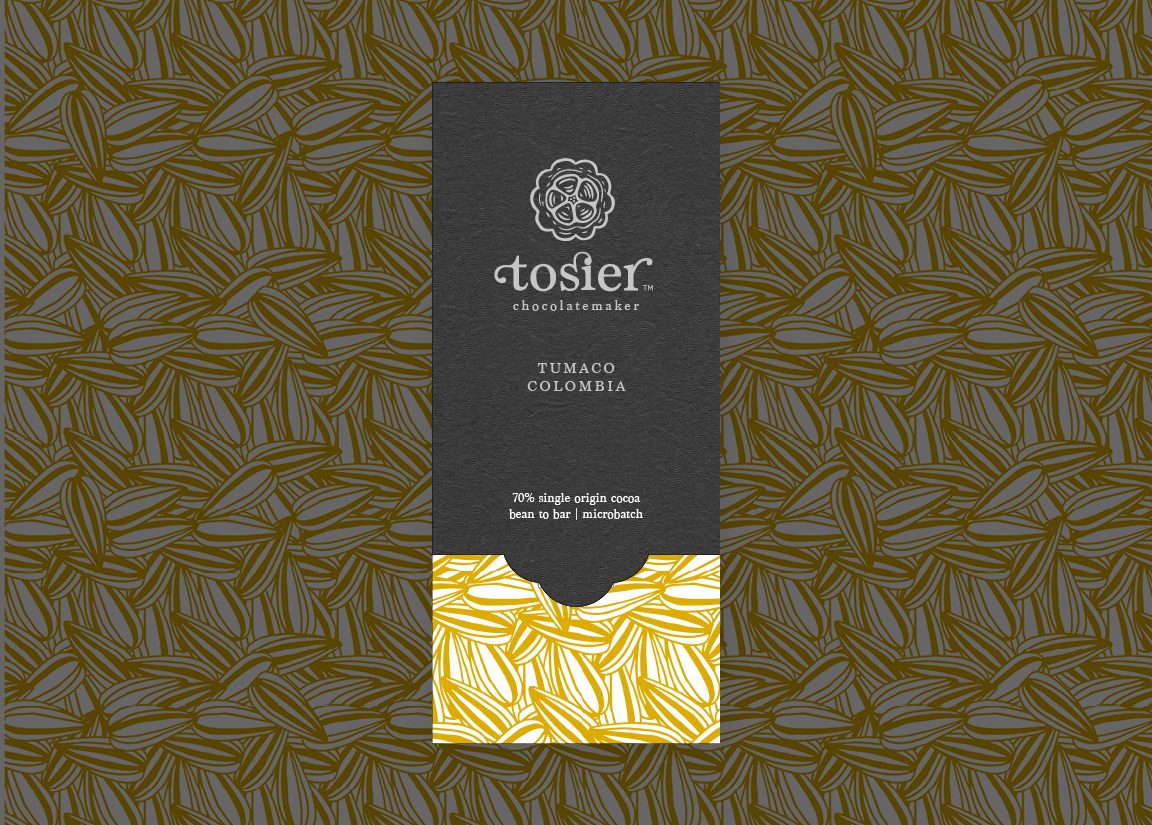
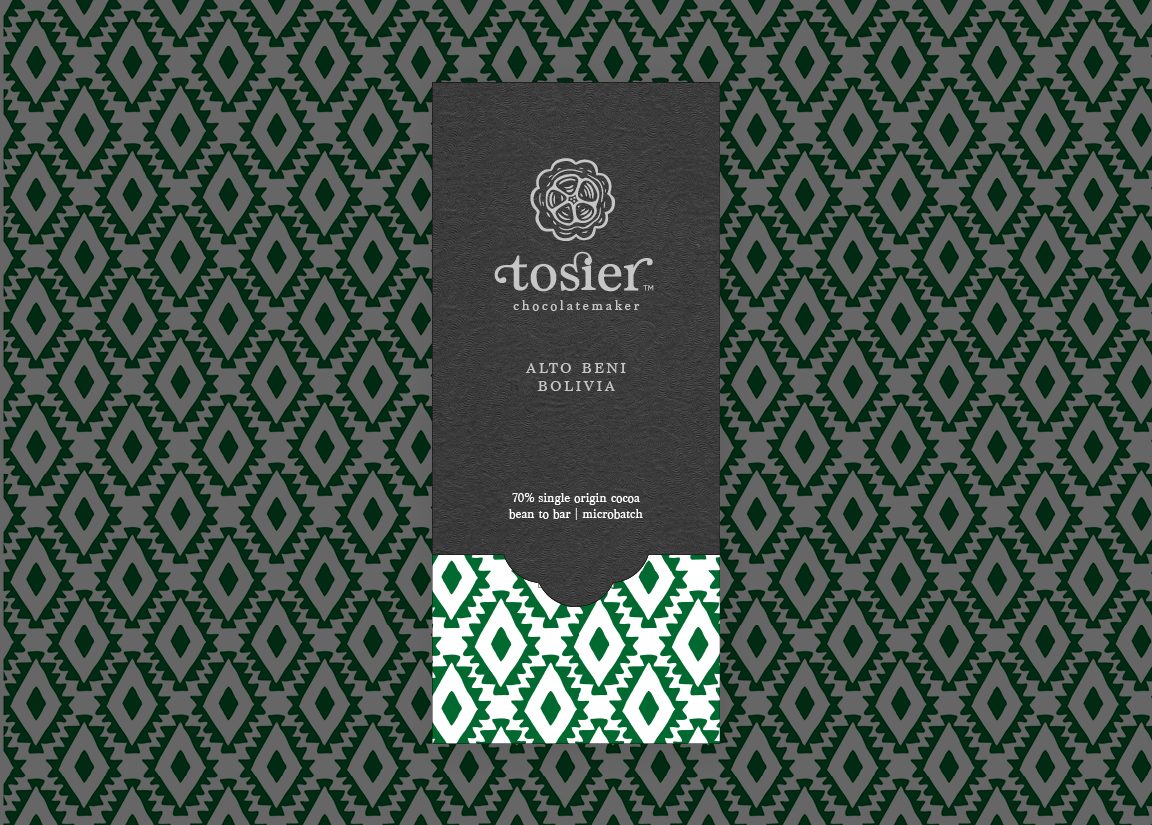
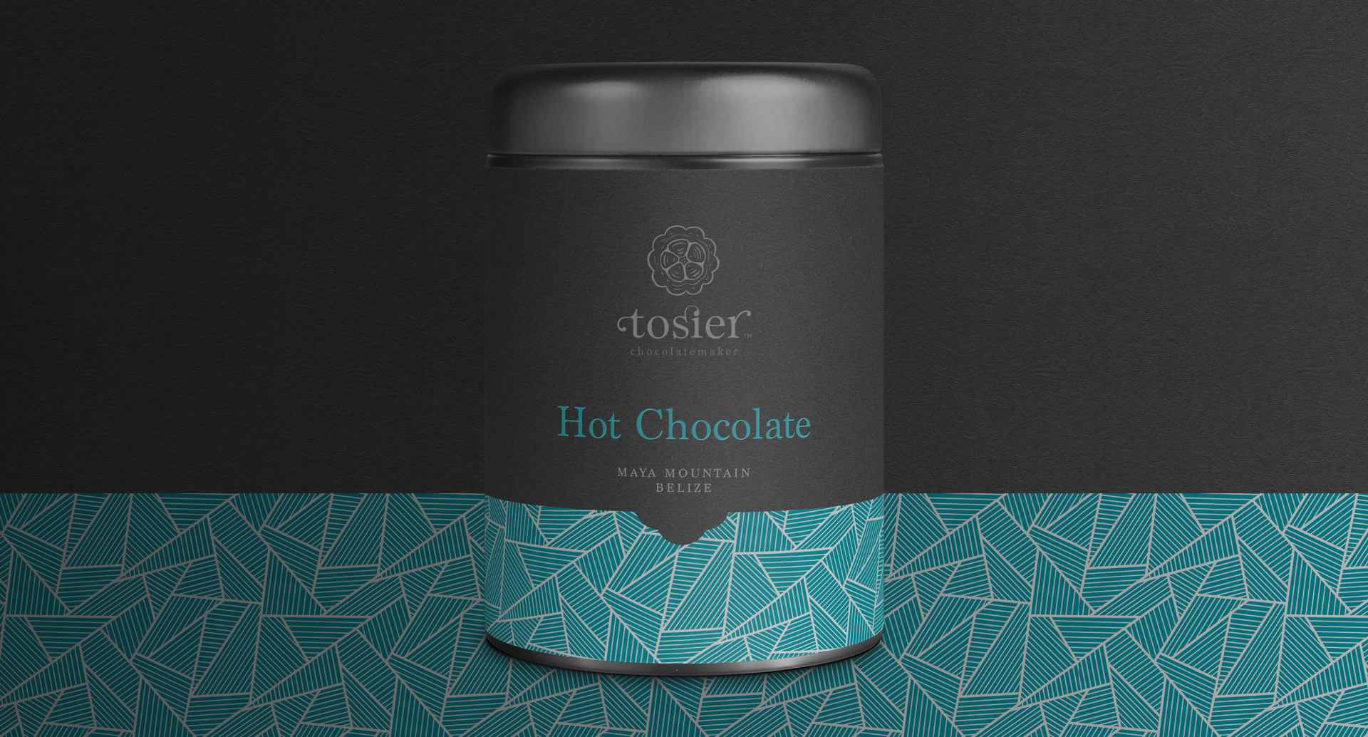
The brand launched with bars expressive of their origins in Columbia, Haiti, Belize and Bolivia. These origins were core in communicating the truely traceable concept which led to a range of graphical illustrations, each giving a strong essence of the area while not overpowering the clean family feel.
The graphical illustrations and colours were inspired by traditional dress and fabric patterns, straw bag weaves and local plants. These were simplified into more abstract strokes, emphising more of the patterns which are commonly associated with each country.
The packaging shape was bespoke, with the reseal tab taking inspiration from the cocoa bean so it added to the feel but was practical too. The bar was then wrapped in thick foil paper and finished with a coloured cocoa bean sticker. Each box was then covered in a soft touch laminate and finished with silver foil to the logo and regional name.
“We really enjoyed working with That’s Brave on our branding. The final designs – a distillation of much work – were really successful and our branding and packaging has given us a real stand-out in an increasing crowded market.”
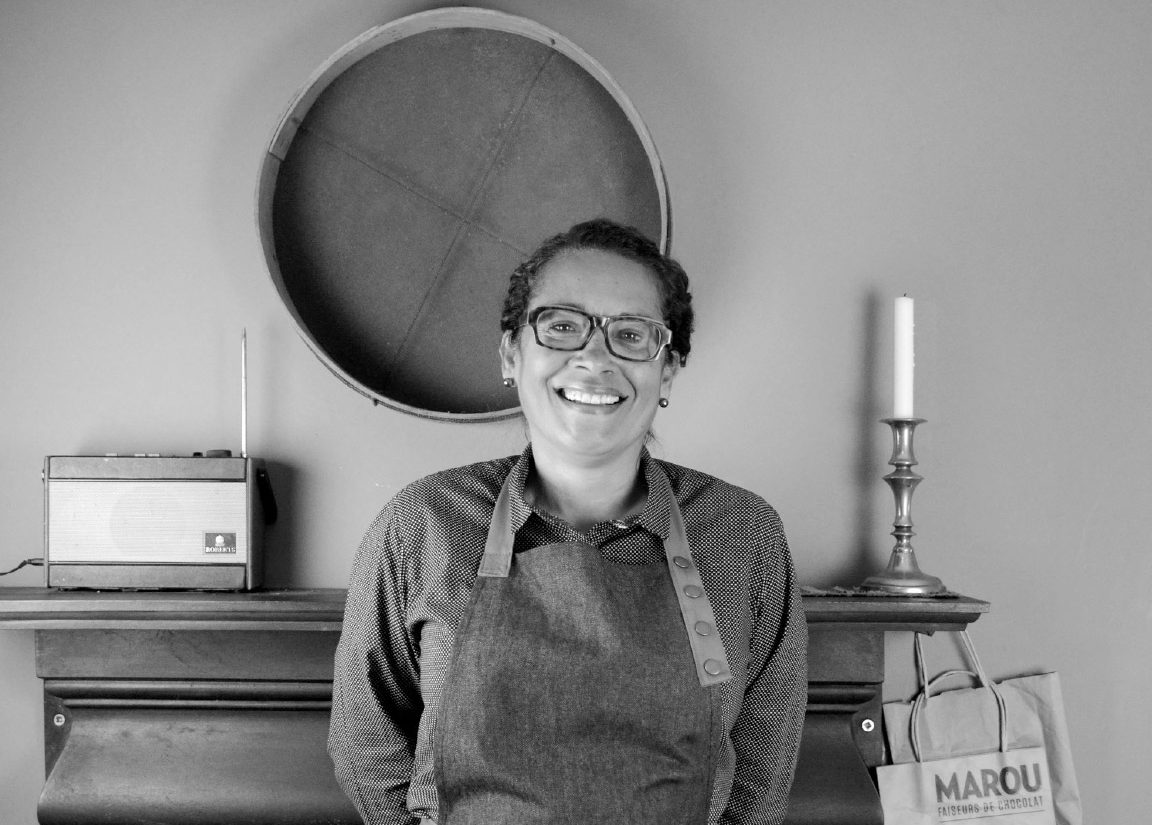
Deanna Tilston - Chocolate Maker and Owner
Engagement.
Within the first six months, Tosier is already a multi award winning brand. Three of its four bars were recognised at the 2018 Academy of Chocolate Awards with ‘Maya Mountain’ scooping gold in the ‘Dark, bean-to-bar under 80%’ category.
The branding, and particularly its packaging, has had amazing reviews at events over the country.